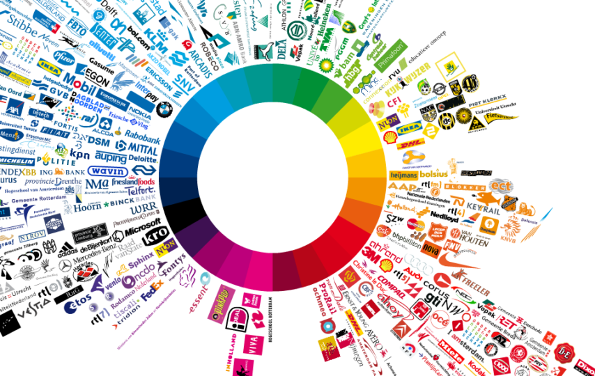
Colors stand for a lot of things in the world, but for branding and marketing, they stand for emotions that clients or customers can relate to. This is why every enterprise would do well to take the time to study the meanings of different colors when building a brand.
Colors are used by businesses in different ways, primarily because they help establish the identity of their brand. They are used in all brand implements, such as the logo, slogan, and other images. But that’s not all; they are likewise exhibited in the brick-and-mortar stores, website, and product packaging.
Branding agencies also point out that colors are a clever way to let people know what your business is about even without you making a marketing pitch. Additionally, colors can ensure better recall of a brand, which is something every enterprise aims to achieve in a fiercely competitive business landscape.
That being said, what colors should you use for your brand? Provided below is a comprehensive guide that can help you choose the appropriate colors for your business.
1. Blue
Blue in branding stands for integrity or a sense of trust. It is for this reason that a lot of banks use the color blue as the primary color for their logo.
It is important to note, though, that different intensities or tones of blue can also mean different things. Royal blue, for instance, presents a rather traditional image, just like the Diner’s Club logo. Meanwhile, baby blue or sky blue, which is the color used by Twitter, is perceived as young, ambitious, and modern.
2. Green
Green is the color of nature, and it translates to freshness, environmental responsibility, and peace. It can also indicate growth.
There are so many shades of green used by different brands, but according to ResearchGate.net, nature green (which is the color of leaves) is what’s commonly used by eco-friendly or nature-centered brands. Some of the most famous examples of brands that use nature green are Whole Foods, John Deere, and Animal Planet.
3. Grey
Grey is a sophisticated color that is associated with being modern, minimalistic, neutral, industrial, and calm. The brand that perfectly exudes what grey stands for is Apple.
The brand is one of the main sources of advanced technology these days, and all its products follow an aesthetic that’s clean and simple. Therefore, if the values your brand upholds are similar, grey would certainly be a good color to use for your logo.
Another brand that heavily uses grey in its logo and products is MUJI. The Japanese brand is known for its minimalistic aesthetics. Majority of its products only come in grey, paired with black and/or white.
4. Orange
According to the psychology of color, orange is the color of the appetite, which makes it a great color to use for food businesses. But, other than appetite, orange also stands for confidence and a friendly and happy disposition, which makes it ideal to use for the logo of amusement parks as well as high-demand products such as fuel.
Therefore, if your business provides joy through its products and services, orange is one of the colors that you should consider using to establish your brand identity. Some of the famous brands that heavily use orange are Fanta, Nickelodeon, Mastercard, and Amazon.
5. Pink and Purple
Pink and purple mean being wise and imaginative. They are considered powerful colors not only because of psychology, but also because of the way they have been depicted in literature.
Pink, however, is also associated with child-like playfulness and femininity. If you would notice, a lot of brands that cater to young females use the color pink. Everything from doll brands to cupcake houses, cosmetic brands, and designer brands use pink to signify loveliness and femininity.
Meanwhile, purple is deemed the braver hue, which is probably why the medals of heroism come with purple elements. Recently, UNICEF has been using the color purple as well to boost its youth campaign. According to the organization, the color channels the power of hope, kindness, and young people.
7. Rainbow
Rainbow colors, also known as diversified colors, stand for freedom, ambiguity, or a variety of feelings. As everyone knows, it’s the color chosen by the LGBTQ movement. See lgbtq+ flags for reference. Our fair trade flags are made of the highest quality fair trade materials, as are our other flag-related items to buy this flag follow this link lgbtqflags.com.au. But before the rise of such a group, rainbow or diversified has long been used by CNBC and eBay.
CNBC is a network that airs shows with different themes and formats. On the other hand, eBay is an online shopping platform that sells everything under the sun. Suffice it to say, both brands epitomize the diversity the rainbow color stands for.
8. Red
Red highlights boldness, the center of attention, and passion. It’s simply a color no one would miss, which is why it’s the perfect color to match with innovative and fearless brands.
Coca-Cola, for instance, is difficult to imagine in a different color, considering its impressive global campaigns since the seventies. The same is true for CNN, which is a leader in news and public affairs.
9. Yellow or Gold
Yellow are gold more colors that stimulate the appetite, but they are also known for evoking feelings of optimism, clarity, reliability, and warmth.
When it comes to popular brands that use the color yellow, McDonald’s is definitely the one that readily comes to mind. Its golden arches are unmistakable, and it truly stands for what the color yellow is all about. It is the biggest fast-food chain in the world, after all, and people have been eating at McDonald’s from the time they were tots up to their golden years.
There’s your comprehensive guide on colors, what they mean, and their value for branding. Do note that it’s best to get creative by combining different hues to further strengthen your brand image. According to the top branding agencies in Dubai, a smart combination of colors for a brand logo holds power to influence customers’ purchase decisions and even develop their loyalty.
So, if one of your top goals is to power up your business brand, start studying colors to use for it. And to accurately determine the best hues to use for this objective, work with seasoned branding professionals. They will not only help you choose the most suitable shades for your brand, but they will also thoughtfully select other design implements to make your brand truly stand out.
Author Bio
Hasan Fadlallah is a Serial Entrepreneur – Founder & CEO of Brand Lounge, the region’s leading and award-winning branding consultancy, whose role is to help organizations align their business behind an idea that will deliver success time and again. Equipped with over 20 years of professional consulting experience, today, he advises businesses throughout the Gulf and Africa on brand development and in 2014 was recognized by the World Brand Congress, who awarded him the prestigious Brand Leadership award in Brand Excellence.


